I'm intrigued with finding out more about the creative process of creating real-life things, as it will be helpful in designing venues that work. Last night, I caught an interesting documentary on Discovery, on the creation of the SYN-US, a Ford concept car for the Detroit Auto Show in 2005.
 What is the SYN-US?
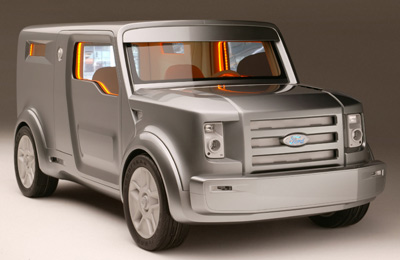
Well, as you can see from the picture, it's a tough-looking car. Part of its name comes from the word Synthesis, meaning a mix of the hard, edgy exterior, and the soft, flowing interior.
Some of the influences were, as far as I can tell:
- the hard landscape of the US (mainly L.A.)
- possibly post-911 sentiments (speculation)
- the "Pimp my ride" madness, which affected interior design (speculation)
- the pressure of concept-car competition - trying to be different
- the particular profile of cars showcased at the Detroit show - typically manly
- the SUV (exterior) versus the metro-sexual trend (interior) (speculation)
- the engineering platform used (more on this later)
The evolution of the car-image
During the documentary, the Ford's brand-image person, responsible for this project, gave a nice overview of the way the car has been perceived and designed over time.
60s - rebellion = tough cars
70s - confusion = she didn't know if there was a clear trend
80s - status = luxury cars
90s - lifestyle = differentiated cars
00s - choice = more and more fragmentation in design
Project SYN-US
For some reason, Ford decided on a B-model car, meaning a smaller model, even though those traditionally didn't do well in the US. From what I could see, the process was done in several stages: research; design; building phase; and interior design. All of which had different considerations, and was, of course, supervised by Ford's management (e.g. the brand-image person). And then of course, the presentation phase.
Research-phase
Essentially, the team needed to form an image of the current situation in the US, as well as how it would develop, to design a product that would fit in, or possibly lead the way. A couple of (cocky) trend-researchers were hired, who tried to look at all things currently playing on the market (I speculate: post-911, pimp-my-ride, beginning of the green trend, metro-sexuality), from the internet and other media, as well as just driving around. The project was code-named "Gorilla" of that gives you a clue. They came up with a film, which was supposed to inspire the designers while creating the concept.
Design-phase
This was conducted by two main designers, one British and one Italian, I think, who came up with a tank-like model with a soft interior. This model was moulded in clay by an advanced machine, and little tweaks were made on the outside. One of these was to create door-handles which appeared like those used on a safe.
Important is to realise that there was a big constraint to the project: the engineering platform. For economic reasons, it can be useful to use existing technology, because that would make the whole product-process much cheaper (factories don't have to be adapted, etc.). In this case, they choose the existing B-model, the Ford Sierra, which had consequences on the dimensions of the SYN-US and type of engine used. Usually, I think this is done when a previous model in the same category is doing very well, and it would not be sensible to create a whole new parallel production process.
The building-process
I can't say much about that. Much machine work and quite integrated with the previous phase. I can say that the design was exaggerated for effect—auto-shows can be very competitive.
Interior-design
Again, quite integrated with the previous phase. Essentially, a trendy-looking interior designer (female, Swedish-looking) was brought to the project to bring this soft, flowing vision of the interior to reality. She decided on soft, skin-like materials in an equally skin-like colour theme. Noteworthy was that she had the words "do not touch" painted on the door-handle, expecting people to want to touch it anyway. Those quirky designers...
The presentation phase
Not much to say here either. A movie was shown, an executive gave a speech, and people could touch it. Typical auto-show stuff. Apparently feedback was not too negative.
All of this reminds me of the knowledge spiral, a concept known in innovation. Basically it's the movement from tacit knowledge—highly personal, hard to formalise and communicate—to explicit knowledge—formal and systematic, easily communicated and shared—back to tacit knowledge, and again explicit knowledge, moving in a continuous spiral. Essentially this works in a fairly rhythmic pattern, staring with an individual that comes up with an idea.
This idea comes from some kind of tacit place—a feeling, experience, know-how. In the case of the SYN-US, it was the trend-research being done. This can be communicated to others, but slowly, maybe in a participative style (the documentary-film that they produced). This must then be made explicit for the organisation (Ford) to use this knowledge. A design is made as well as a model—explicit knowledge is shared among the project people. If this model is successful, it can be shared throughout the model-B division (like happened between the Ford Sierra and this project) and the explicit knowledge spreads. After a while, it can become internalised in the principles and values of the firm, in which case it again becomes tacit. The company can then use this tacit know-how to develop further innovations, ingraining some of what they know already into future designs.
So essentially the movement, like on the picture is:
tacit - tacit
tacit - explicit
explicit - explicit
explicit - tacit
etc.
More on the knowledge spiral can be found here.
Final thoughts 2: relating this to Food and Retail
In the sense of architecture, you have two types of design. The original, where you construct a building, which can develop in a similar process as above, and in the sense of an engineering platform—you end up working with the constraints imposed by the internal space, as well as the environment you are working in. In both cases, some interesting lessons come forth from the way the SYN-US was developed.
FnR-businesses are also people-businesses, which can benefit from understanding the way the knowledge-spiral works. Essentially someone (the founder) can have an idea, it is still tacit at this stage. His or her initial partners will also likely share the same values or be able to understand them quickly. But the bigger the organisation becomes, the more important it is to work on the explicit. Developing operational manuals, films, processes, etc. all of which can be shared through training and other communication, are essential to growing large and well-working organisations. Again, the way the the SYN-US was developed—by people and through processes—sheds some light on that issue.
Filed under: branding, culture, design, human resources, innovation, management, operation, retail, technology, tools, trends, USA, vision
Design case-study: The Ford SYN-US
I'm intrigued with finding out more about the creative process of creating real-life things, as it will be helpful in designing venues that work. Last night, I caught an interesting documentary on Discovery, on the creation of the SYN-US, a Ford concept car for the Detroit Auto Show in 2005.
 What is the SYN-US?
Well, as you can see from the picture, it's a tough-looking car. Part of its name comes from the word Synthesis, meaning a mix of the hard, edgy exterior, and the soft, flowing interior.
Some of the influences were, as far as I can tell:
- the hard landscape of the US (mainly L.A.)
- possibly post-911 sentiments (speculation)
- the "Pimp my ride" madness, which affected interior design (speculation)
- the pressure of concept-car competition - trying to be different
- the particular profile of cars showcased at the Detroit show - typically manly
- the SUV (exterior) versus the metro-sexual trend (interior) (speculation)
- the engineering platform used (more on this later)
The evolution of the car-image
During the documentary, the Ford's brand-image person, responsible for this project, gave a nice overview of the way the car has been perceived and designed over time.
60s - rebellion = tough cars
70s - confusion = she didn't know if there was a clear trend
80s - status = luxury cars
90s - lifestyle = differentiated cars
00s - choice = more and more fragmentation in design
Project SYN-US
For some reason, Ford decided on a B-model car, meaning a smaller model, even though those traditionally didn't do well in the US. From what I could see, the process was done in several stages: research; design; building phase; and interior design. All of which had different considerations, and was, of course, supervised by Ford's management (e.g. the brand-image person). And then of course, the presentation phase.
Research-phase
Essentially, the team needed to form an image of the current situation in the US, as well as how it would develop, to design a product that would fit in, or possibly lead the way. A couple of (cocky) trend-researchers were hired, who tried to look at all things currently playing on the market (I speculate: post-911, pimp-my-ride, beginning of the green trend, metro-sexuality), from the internet and other media, as well as just driving around. The project was code-named "Gorilla" of that gives you a clue. They came up with a film, which was supposed to inspire the designers while creating the concept.
Design-phase
This was conducted by two main designers, one British and one Italian, I think, who came up with a tank-like model with a soft interior. This model was moulded in clay by an advanced machine, and little tweaks were made on the outside. One of these was to create door-handles which appeared like those used on a safe.
Important is to realise that there was a big constraint to the project: the engineering platform. For economic reasons, it can be useful to use existing technology, because that would make the whole product-process much cheaper (factories don't have to be adapted, etc.). In this case, they choose the existing B-model, the Ford Sierra, which had consequences on the dimensions of the SYN-US and type of engine used. Usually, I think this is done when a previous model in the same category is doing very well, and it would not be sensible to create a whole new parallel production process.
The building-process
I can't say much about that. Much machine work and quite integrated with the previous phase. I can say that the design was exaggerated for effect—auto-shows can be very competitive.
Interior-design
Again, quite integrated with the previous phase. Essentially, a trendy-looking interior designer (female, Swedish-looking) was brought to the project to bring this soft, flowing vision of the interior to reality. She decided on soft, skin-like materials in an equally skin-like colour theme. Noteworthy was that she had the words "do not touch" painted on the door-handle, expecting people to want to touch it anyway. Those quirky designers...
The presentation phase
Not much to say here either. A movie was shown, an executive gave a speech, and people could touch it. Typical auto-show stuff. Apparently feedback was not too negative.
All of this reminds me of the knowledge spiral, a concept known in innovation. Basically it's the movement from tacit knowledge—highly personal, hard to formalise and communicate—to explicit knowledge—formal and systematic, easily communicated and shared—back to tacit knowledge, and again explicit knowledge, moving in a continuous spiral. Essentially this works in a fairly rhythmic pattern, staring with an individual that comes up with an idea.
This idea comes from some kind of tacit place—a feeling, experience, know-how. In the case of the SYN-US, it was the trend-research being done. This can be communicated to others, but slowly, maybe in a participative style (the documentary-film that they produced). This must then be made explicit for the organisation (Ford) to use this knowledge. A design is made as well as a model—explicit knowledge is shared among the project people. If this model is successful, it can be shared throughout the model-B division (like happened between the Ford Sierra and this project) and the explicit knowledge spreads. After a while, it can become internalised in the principles and values of the firm, in which case it again becomes tacit. The company can then use this tacit know-how to develop further innovations, ingraining some of what they know already into future designs.
So essentially the movement, like on the picture is:
tacit - tacit
tacit - explicit
explicit - explicit
explicit - tacit
etc.
More on the knowledge spiral can be found here.
Final thoughts 2: relating this to Food and Retail
In the sense of architecture, you have two types of design. The original, where you construct a building, which can develop in a similar process as above, and in the sense of an engineering platform—you end up working with the constraints imposed by the internal space, as well as the environment you are working in. In both cases, some interesting lessons come forth from the way the SYN-US was developed.
FnR-businesses are also people-businesses, which can benefit from understanding the way the knowledge-spiral works. Essentially someone (the founder) can have an idea, it is still tacit at this stage. His or her initial partners will also likely share the same values or be able to understand them quickly. But the bigger the organisation becomes, the more important it is to work on the explicit. Developing operational manuals, films, processes, etc. all of which can be shared through training and other communication, are essential to growing large and well-working organisations. Again, the way the the SYN-US was developed—by people and through processes—sheds some light on that issue.
Subscribe to:
Post Comments (Atom)
 The
The 

