 It's funny how there are actually a lot of similarities between software design and architecture, and venue design and architecture. When building code, you decide on a path which may be difficult to break in the future. And the same when building or inhabiting a building.
And when designing software, you have to do so with the user in mind, or at least you should do so. It is the same with designing your venue for optimal interaction.
A site, I've recently been reading for general design-thoughts is GUUUI.com. It is mainly focussed on websites and designing for interaction, but I find a lot of similarities to the stuff I'm thinking about. Useful are for instance:
- how to structure sites with lots of content: which applies to stores with lots and lots of content as well. Unsurprisingly, it involves departments.
- how to cure banner blindness: which has consequences on ad-design in the real world as well. Apparently plain text, faces, and cleavage / other "private" body-parts work well.
The costs of errors are great in both software and real-world venue design, though much greater, at least financially, for the latter. Still, it can very damaging to any business—soft or hard—to start of ill-designed, leading to bad reviews, and worse, scare of customers after the first impression. So it greatly helps to be prepared, even have planned out scenarios on paper or software. That's where use cases come in.
Wikipedia defines a use case as:
"describing the interaction between a primary actor—the initiator of the interaction—and the system itself, represented as a sequence of simple steps. Actors are something or someone which exist outside the system under study, and who (or which) take part in a sequence of activities in a dialogue with the system, to achieve some goal: they may be end users, other systems, or hardware devices. Each use case is a complete series of events, from the point of view of the actor."
Makes a lot of sense in in-store environments as well, doesn't it. You are designing your store as a system of parts—the room, the colours, the products, the placement, the people, the transaction, the exit, etc. And the customer / visitor is the actor.
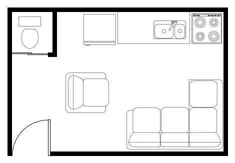
In software, you would probably use something like Visio on Windows and OmniGraffle on the Mac to paint out scenarios. And I checked, OmniGraffle does in fact provide stencils for office-layouts, which could easily be adapted to store-enviroments. And Graffletopia.com, a site dedicated to user-created stencils, has a section on architecture as well!
Nice to know that tech and real life are not so different after all.
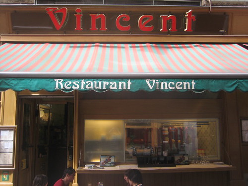
The picture is courtesy of simonyi
Filed under: customers, design, e-commerce, marketing, Research, retail, technology, tools
 It's funny how there are actually a lot of similarities between software design and architecture, and venue design and architecture. When building code, you decide on a path which may be difficult to break in the future. And the same when building or inhabiting a building.
And when designing software, you have to do so with the user in mind, or at least you should do so. It is the same with designing your venue for optimal interaction.
A site, I've recently been reading for general design-thoughts is GUUUI.com. It is mainly focussed on websites and designing for interaction, but I find a lot of similarities to the stuff I'm thinking about. Useful are for instance:
- how to structure sites with lots of content: which applies to stores with lots and lots of content as well. Unsurprisingly, it involves departments.
- how to cure banner blindness: which has consequences on ad-design in the real world as well. Apparently plain text, faces, and cleavage / other "private" body-parts work well.
The costs of errors are great in both software and real-world venue design, though much greater, at least financially, for the latter. Still, it can very damaging to any business—soft or hard—to start of ill-designed, leading to bad reviews, and worse, scare of customers after the first impression. So it greatly helps to be prepared, even have planned out scenarios on paper or software. That's where use cases come in.
Wikipedia defines a use case as:
"describing the interaction between a primary actor—the initiator of the interaction—and the system itself, represented as a sequence of simple steps. Actors are something or someone which exist outside the system under study, and who (or which) take part in a sequence of activities in a dialogue with the system, to achieve some goal: they may be end users, other systems, or hardware devices. Each use case is a complete series of events, from the point of view of the actor."
Makes a lot of sense in in-store environments as well, doesn't it. You are designing your store as a system of parts—the room, the colours, the products, the placement, the people, the transaction, the exit, etc. And the customer / visitor is the actor.
In software, you would probably use something like Visio on Windows and OmniGraffle on the Mac to paint out scenarios. And I checked, OmniGraffle does in fact provide stencils for office-layouts, which could easily be adapted to store-enviroments. And Graffletopia.com, a site dedicated to user-created stencils, has a section on architecture as well!
Nice to know that tech and real life are not so different after all.
The picture is courtesy of simonyi
 The
The 

